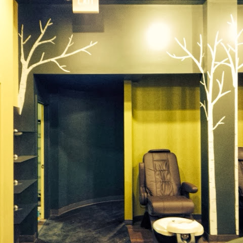
Its sort if been my dream to organically create my design on a large scale. The birch tree was the perfect subject to do this. Each tree organically grew from a single line into a large life size tree. My minor in landscape horticulture is finally paying off. I always try and keep my flora designs accurate in their structure. By hand painting the design, versus using wallpaper, I can fit the design perfectly into the space, going around corners and up onto walls. Each design is unique to the space it is in.
Now, follow me through the space..
The back wall..
The back entry..
Between the wash closets..
The front entry, left side..
Right side..
Close up..
Front desk..
Back entrance..
Front desk..
Back entrance..
Having the design changed, from the leaves in the front to the birch trees, was a miracle in disguise. I put in a lot of hours in some pretty cold weather on that first design and I loved the design, but the space it was on just wasn't quite right to see the design and experience it fully. I've learned over the years to not get so attached to my artwork, so when the decision came to paint over all my hard work, I picked up a paint brush and started over. I'm glad I did because the new design worked so well that I got to continue on the inside, which I was not originally contracted to do. Everything always works out in the end and I feel so happy, excited and accomplished to have worked on and finished this project.
Big thanks to Erica Riggio and Angela Justice from Riggio Designs for including me on this design and project. Their ideas are big and bold and they created a beautiful space!
Be Bold in your Design.
peace&love
Rebecca


Fabulous! Love the scale of the trees and how they "ignore" corners, doors, and trim to create that graphic dominance that gives the space it's WOW factor! Congratulations, Rebecca! Wonderful work!
ReplyDelete